

loading

Our Blog

Check out our innovative pump solutions and industry insights to see what's new in the pumping industry. Stay up to date with the latest trends and news in the world of pumping technology by following our pumping technology blog.

Why Choose Damask Labels for Your Products?

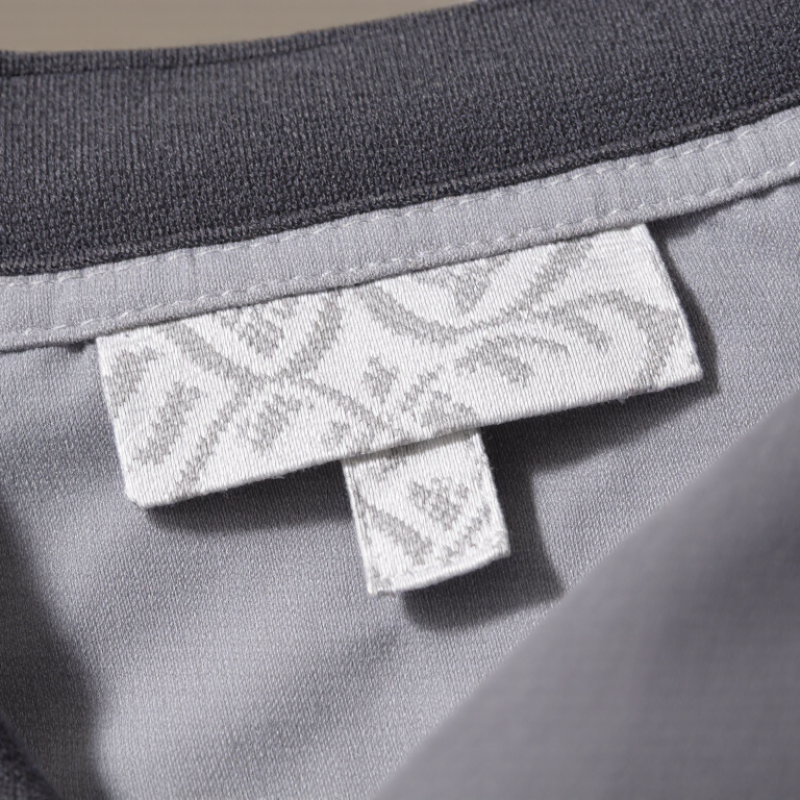
A product label does more than display a brand name. It gives customers a close-up impression of the care behind a garment. Damask Labels use finely woven threads to create crisp lettering, detailed motifs, and a smooth, refined surface. On a jacket collar or shirt hem, that texture can feel more considered than a simple printed tag. Small details count.

The weave can also help preserve fine designs through regular handling and washing, though performance depends on the yarn, construction, and care routine. A dense pattern may keep small text readable, while a softer finish can reduce irritation against the skin. These qualities make damask a popular choice for clothing, accessories, and other fabric goods. Still, it is not automatically the right option for every product.

This article explores how damask labels are made, what affects their appearance, and where they work best. It also considers practical choices such as label size, edge finish, color contrast, and placement. A logo that looks clear on a screen may lose detail when woven at a small scale. Requesting and reviewing a physical sample can reveal issues that a digital proof misses. It takes an extra step. But it can prevent a label from feeling too stiff, appearing crowded, or clashing with the fabric. The best choice balances visual detail with comfort, durability, and the everyday experience of using the product.
Why Choose Damask Labels for Your Products?

What Damask Labels Are and How They Are Woven

Damask labels are woven fabric labels, not printed patches. Their design is built from colored threads, so lettering and symbols become part of the cloth. The surface often feels smooth and slightly lustrous. Run a fingertip across one, and the fine weave is easy to notice.

The label is made on a jacquard loom, which controls individual warp threads as weft yarns pass across them. This allows small details and several colors to appear in a compact area. Thread density matters. A tighter weave can hold crisp shapes, while very fine wording may still blur or close up. Always check a physical sample when tiny text is important.

There is a trade-off. Damask can show detailed artwork, but it may cost more than simpler woven options, depending on quantity and specifications. The finished label is cut and may have folded or heat-sealed edges to suit its placement on a garment or accessory. I have seen attractive designs lose clarity when the artwork was crowded. Simpler often reads better. Ask about size, thread colors, and edge finishing before approving production.

Key Features of Damask Labels

Damask labels are valued for their fine detail and smooth, tightly woven surface. Thin threads can form small lettering and crisp borders that may be difficult to reproduce with a coarser weave. The result feels soft against fabric, yet holds its shape through regular handling. A folded label can also show a logo or size information on both sides. Nice and practical. The final appearance depends on thread choice, artwork, and weaving quality, so samples are worth checking before production.

Tips: Review a physical sample under natural light. Check whether small text stays readable and whether the label edges feel comfortable against skin. Share the garment’s wash conditions with your supplier, too.

Damask labels suit many garments, from shirts to knitwear, because they combine detail with a neat, polished finish. Their closely woven construction can help details remain clear over time, though no label is immune to wear. Very small lettering may soften, especially when the design uses many colors or fine lines. That is a limitation worth considering. Keep artwork simple, and confirm dimensions, fold style, and placement before approving the final sample.

How Damask Labels Compare With Other Label Types

Damask labels are woven, not printed, so their lettering is formed by interlaced threads. This gives logos a textured, substantial feel and helps details withstand repeated handling. Compared with printed labels, damask usually suits crisp lettering and compact symbols better than photographic gradients. Very small text can still blur; thread has limits.

Satin labels feel smoother against skin and can show fine, glossy detail, but their surface may snag or crease more easily. Printed labels allow flexible colors and short runs, though performance depends on ink, fabric, and wash conditions. Heat-transfer labels avoid sewn edges, a comfort advantage on soft garments, but adhesion and stretch compatibility need testing. No label wins every use.

Material choice matters. Textile Exchange’s Materials Market Report 2024 estimates global fiber production reached 124 million tonnes in 2023, across many fiber types. That variety makes sample testing more useful than choosing by appearance alone. For a sturdy jacket, damask can provide tactile, lasting branding; for lightweight sleepwear, a soft satin or well-tested heat transfer may feel better. Check the actual garment after laundering. One detail is easy to overlook: dense woven lettering can feel firm on delicate fabric.

Why Choose Damask Labels for Your Products? — How Damask Labels Compare With Other Label Types

Comparison Damask Woven Labels Satin Printed Labels Heat-Transfer Labels Printed Cotton Labels
How the design is made The design is formed by weaving colored yarns into the label. Ink is printed onto a smooth satin fabric. A printed design is transferred onto the product with heat and pressure. Ink is printed onto a cotton fabric label.
Appearance and detail Woven texture gives designs a defined, dimensional look. Fine detail is possible, though extremely small text may be harder to read. The smooth surface works well for small text and detailed printed artwork. Creates a flat, low-profile design without a separate fabric label. Has a natural, matte, slightly textured appearance; fine detail depends on the fabric and printing method.
Feel and profile Flexible, with a woven texture. Softness and thickness vary with yarn, weave, and finishing. Usually smooth and lightweight, though the cut edges and label construction affect comfort. Very thin and smooth when correctly applied; does not add a sewn label edge. Soft, fabric-like, and more textured than satin or a heat transfer.
Durability considerations Color is part of the woven structure rather than a surface print. Wear and laundering performance depend on yarn quality, construction, and care. Print can fade or wear with repeated laundering, depending on ink, fabric, and care conditions. Adhesion and appearance depend on the transfer material, application conditions, fabric, and washing; peeling or cracking can occur if unsuitable or poorly applied. Print may fade with use, while the fabric can fray if edges are not finished. Performance varies by ink and construction.
Attachment to a product Typically sewn into a seam or onto the product; a folded style can provide finished edges. Typically sewn into a seam or onto the product. Applied directly to compatible fabric using heat and pressure; no sewing is needed. Typically sewn into a seam or onto the product.
Care and testing Check the finished label and garment against the intended washing and drying conditions. Test the printed label under the intended care conditions, as inks and fabrics vary. Follow the transfer supplier’s temperature, pressure, and care guidance; test on the actual fabric before production. Check printfastness, shrinkage, and edge finishing under the intended care conditions.
Often considered for Apparel and accessories where a woven, textile-based label is desired. Care or size labels and other applications where a smooth surface and printed text are useful. Garments where a discreet, low-profile label is preferred and the fabric is compatible. Products where a natural-looking cotton label suits the design.
Key trade-off Requires sewing in most applications; very small lettering may need careful design and sampling. Printed appearance may change with wear and washing; sewing is usually required. Not suitable for every fabric or care requirement, and correct application is essential. May be less smooth than satin, and printed detail and durability depend on fabric and finishing.

Performance varies by materials, construction, application, and care. Request samples and test them on the intended product before placing a production order.

Products and Industries That Use Damask Labels

Damask labels suit products where a small woven detail must stay legible through handling. Apparel is a natural fit: jackets, denim, knitwear, and children’s garments often use them at collars, waistbands, or side seams. The fine weave can show compact lettering and simple symbols without a bulky patch. They also appear on bags, footwear, towels, bedding, and other home textiles, where a smooth edge matters against skin or fabric.

The market is broad. Textile Exchange’s 2024 Materials Market Report estimated global fiber production at 124 million tonnes in 2023, reflecting the enormous range of textile goods that may need identification or care details.

That figure measures fiber, not demand for labels, so it should not be read as a damask-label sales statistic.

In use, a woven label can handle repeated folding and washing, but it still needs suitable yarn, contrast, and finishing. Tiny text can blur. Not every product needs one. For soft accessories or premium garments, the label may add a tactile finish; for rough-use goods, testing samples after washing and abrasion is sensible before choosing it.

Factors to Consider When Choosing Damask Labels

Damask labels are woven rather than printed, so the design is formed from threads. When choosing one, consider how much detail the weave can show. Fine lettering and small symbols may lose clarity if the label is too small or the pattern is dense. Requesting a physical sample can reveal details that a screen preview misses. It matters.

Start with the garment and its use. A soft label may suit a lightweight shirt, while a firmer weave can work better on structured outerwear. Check the label’s finished edges and attachment method, too. A folded edge can feel different against the neck than a flat, cut edge. If the item will be washed often, ask for care and durability information relevant to the fabric and intended laundering. Do not assume every woven label behaves the same.

Color contrast affects readability as much as appearance. Ask how thread colors look together in the actual weave, especially for small text. Confirm the finished dimensions, fold style, and placement before approving production. It is easy to focus on the artwork and overlook how a label will feel when sewn inside a garment. I would compare a sample with the fabric itself, then check whether the lettering remains legible from arm’s length. One small compromise may be needed.

Article Source: